|
American Art Archives scans and text are copyrighted material. |
|
Back |
|
|
Harry Anderson
(1906 - 1996) The Art of Loose Realism |
|
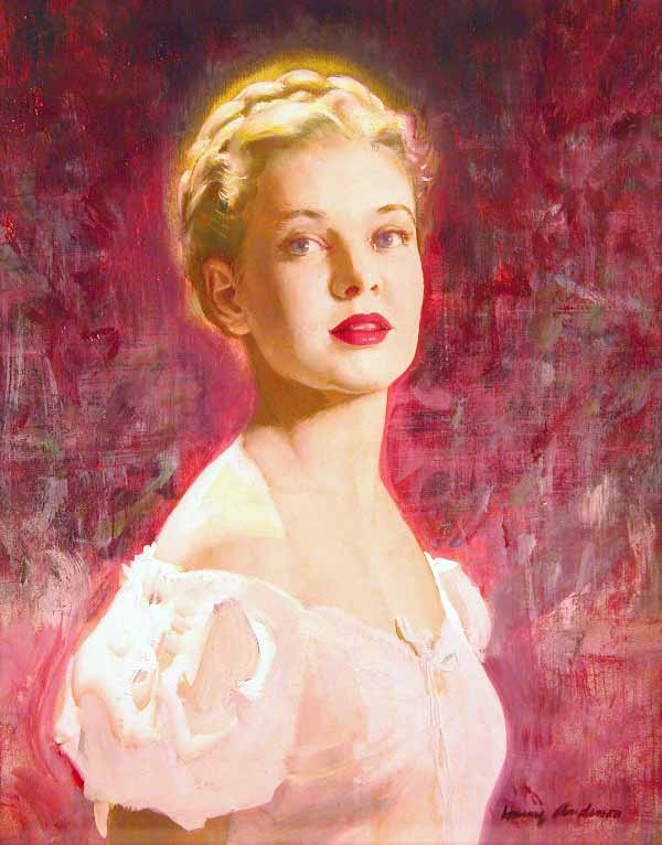
Ladies' Home Journal, "Daughter of Kings" (1951) Anderson, H - 001A |
|
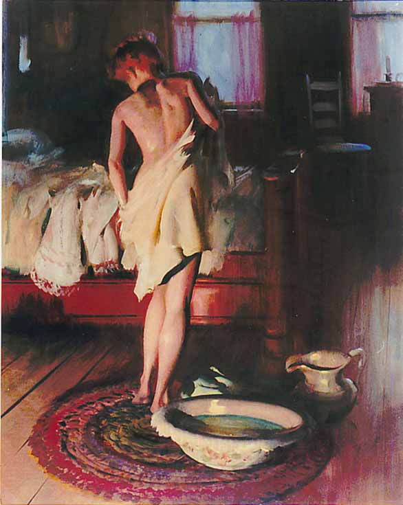
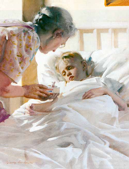
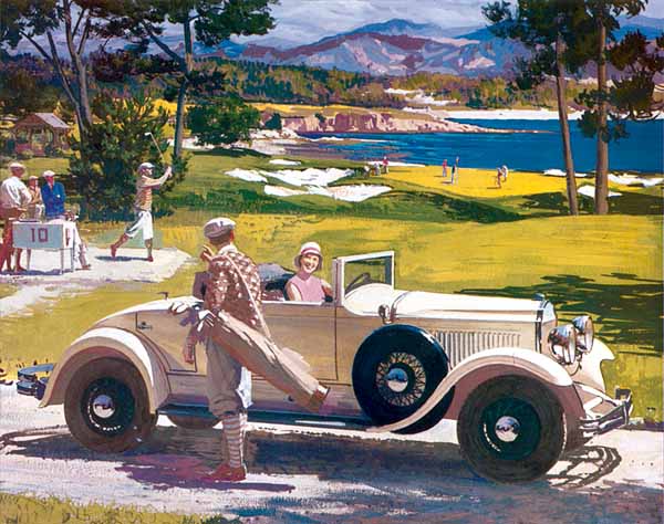
Good Housekeeping (1944) Anderson, H - 002 Painted for the August 3 1944, Good Housekeeping, this period piece displays all of the qualities of an Anderson picture: strong compositional storytelling, comprehensive dynamic light and reflected light, and high chroma hues which draw attention to points of interest. And although this painting appears slick in its portrayal of detail and information, look closely -- it is as loose as it gets. |
|
Cosmopolitan, "Solitarus Street" (1949) Anderson, H - 003 |
|
"Conception, composition, value, draughtsmanship, and painting dexterity," Harry Anderson once said, "must all work together. And they are important in just that order. But the parts all become automatic in time." No picture, according to him, would be deemed acceptable with any of these elements neglected. As one of the top illustrators from the 1930s to the 1980s, Harry spoke with quiet authority on the subject of making pictures. His work graced the pages of all of the nation's high-profile magazines, as well as the most visible advertising campaigns. Quite often, authors would write to Anderson, informing him that he did a better job telling their story with his picture than they had done. |
|
Massachusetts Mutual, "One of the Great Moments |
|
2 + 2 = Artist While registering for his sophomore year at the University of Illinois, Harry was forced to choose an elective in order to fulfill his curriculum requirements. He wanted to select an easy course to lighten the load of his difficult math classes. His choice was a course in still life painting. This elective would forever change his life. As he struggled through the first two semesters of his painting class, a couple of thoughts occurred to him. The career prospects for a mathematician seemed dubious, and that he truly enjoyed painting pictures. By the end of his second semester, Harry’s paintings were beginning to show more ability than the work of his fellow art students. It was about this time that his painting teacher approached him with a direct question. "Have you ever considered art as a profession?" His instructor was an alumnus of the Syracuse School of Art and suggested that Anderson enroll there. In the fall of 1927, he began attending classes at Syracuse as a full-fledged art student. |
|
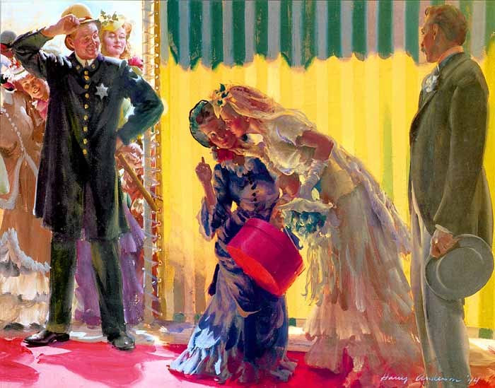
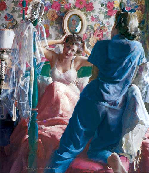
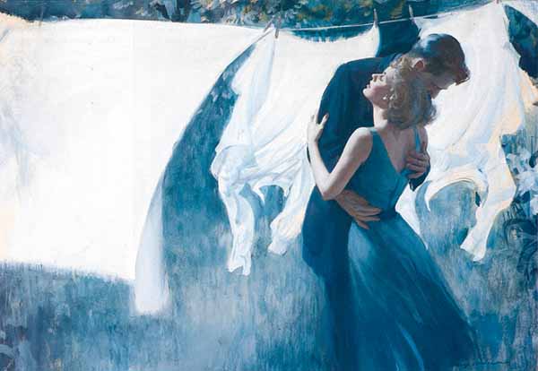
Woman's Home Companion, "The Marriage" (1946) Anderson, H - 005 "The Marriage," painted for the June 1946 Woman’s Home Companion, is a master piece of light and color. The over all effect of loose realism is best observed within the brush strokes of the rug. Here, loosely yet care fully applied areas of paint, create the illusion of a real rug. |
|
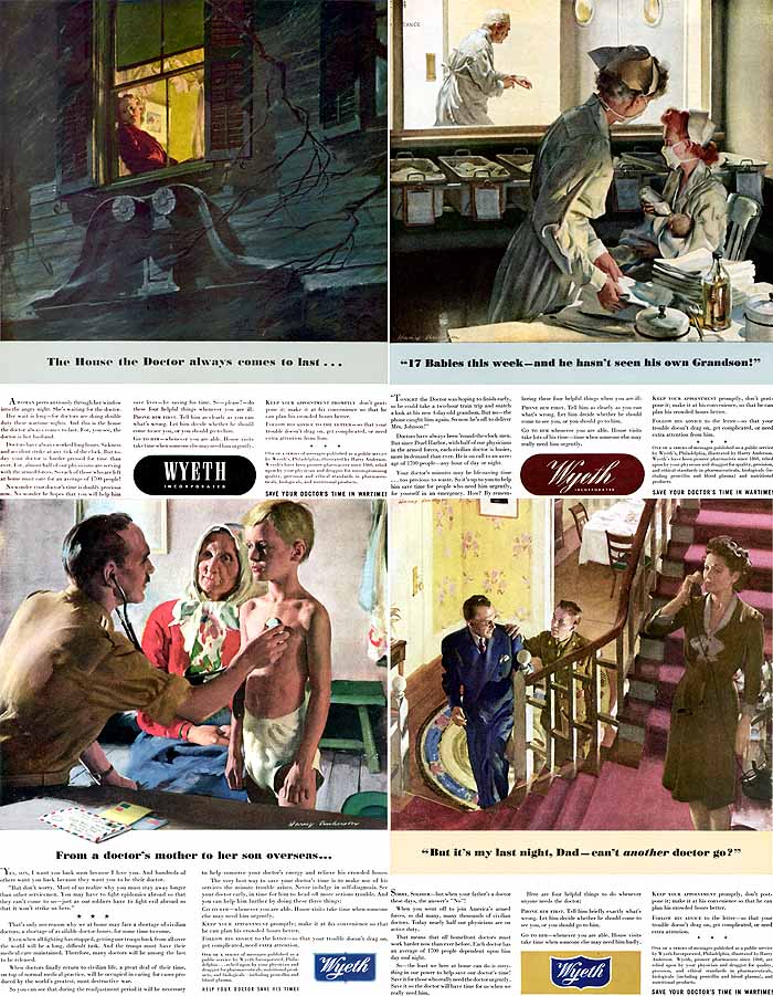
Wyeth (1945) Anderson, H - 006 During WWII, Wyeth Pharmaceuticals ran ads showing American doctors and the demands the conflict put on their lives and those of their families. Wyeth secured the talents of top artists Haddon Sundblom, Douglas Crockwell, and, of course, Harry Anderson, who contributed these four touching pieces. |
|
Bringing Art to Life In his second year, Harry’s focus was on life drawing. Construction of the anatomy was a painstaking course before the days of opaque projectors and art-o-graphs. It was expected the student identify and draw every bone and muscle of the human figure. Later in his life, Harry would express real sorrow for anyone attempting to draw the figure who had not received this fundamental instruction. “It is really impossible,” he said, “to make a clothed figure look realistic without a knowledge of what the body is doing underneath. Not only will the clothes not hang properly, the gestures and posture are likely to be off balance.” Harry studied color theory and painting in his third and fourth years at Syracuse. He would credit illustration instructor Hibbard Kline with much of his academic success, though Tom Lovell would say that he had learned more from Harry Anderson than any of his teachers. After graduating with honors, both artists moved to New York City and set up a studio near Washington Square in McDougall’s Alley. The Alley, originally containing stables and carriage houses had been transformed into art studios. However, the Depression had affected everyone. In those days, only the top illustrators were getting work, so Anderson found a job working the counter at the Mirror Candy Company. He worked evenings, which freed up his days to paint and bring samples of his work to numerous art agencies. After receiving a number of freelance commissions, usually producing book jackets requiring a lot of lettering, Harry got his big break in April of 1932. |
|
Good Housekeeping (1950) Anderson, H - 007 For this painting, Anderson used red as his local color, complementing that with a high chroma green to direct the viewer’s focus. Again, what appears as informational detail is actually a series or grouping of expertly coordinated brush strokes of paint. |
|
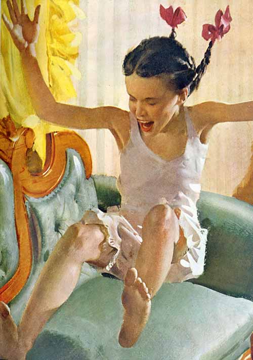
American Magazine, "The Shy Smile" (1949) Anderson, H - 008 |
|
Collier’s magazine had commissioned him to produce an illustration for a short story. The painting was a duotone produced in oil, and in reproduction, filled two columns. With this success. Anderson more confidently approached publishers and art agencies. Harry would credit William Chessman, art director at Collier’s and Frank Eltonhead at Ladies’ Home Journal for helping get his start as an illustrator. He quit his job at the candy store and for the next two years painted diligently, earning enough money to pay off his debts, as well as saving for his return to Chicago. He told his friend Tom Lovell that he had had it up to his eyebrows with New York City. Upon his return to Chicago, Anderson went to work as an illustrator in the bullpen of the Stevens-Gross Art Agency, the most successful art service agency in the Midwest, if not the entire country. They provided a central studio space for all of the artists, reps who brought in the work, along with models and photographers when necessary. For this, Stevens-Gross received 50% of the total amount billed. It was here that Harry began to make his mark in the field of illustration. His first big assignment was a series of illustrations for a Cream of Wheat advertising campaign, produced in 1937. Other advertisers followed suit: Ford, Ovaltine, American Airlines and Buster Brown Shoes now requested his work. However, Harry preferred editorial illustration to advertising art and by 1940 he was receiving assignments from the nation’s most popular magazines, including Collier’s, Redbook, The Saturday Evening Post, Woman’s Home Companion, Ladies’ Home Journal, and Cosmopolitan. |
|
Collier's (1951) Anderson, H - 009 This picture was produced for Collier’s in 1951 with Anderson’s wife, Ruth, posing for him. Many of his editorial paintings were touching and sensitively portrayed. As a result, authors often asked their editors to have Anderson illustrate their story ideas. |
Cosmopolitan, "Just the Two of Us" (1948) Anderson, H - 010 |
|
How to Make a Picture Harry’s attention to referential detail was legendary; often sewing and manufacturing costumes and props. He had also constructed a darkroom in his studio, where he processed and printed his results. Often when there wasn’t time to arrange for a model, he would have friends or co-workers pose for him. While working on a picture for Woman’s Home Companion, Anderson arranged for a pretty young woman named Ruth Huebel pose for him. Ruth was the receptionist for David Smart, the power wielding editor of Esquire Magazine, whose offices were located in the penthouse of the same building which housed Stevens-Gross. A year after they met, Anderson and Huebel were married and started a family shortly thereafter. Anderson would join famed illustrator Haddon Sundblom’s circle of artists, increasing his workload of highly visible accounts, including Coca-Cola. |
|
Ladies' Home Journal, "A Way With Boys" (1948) Anderson, H - 011 Producing a painting in a high key lighting situation, as in “A Way With Boys,” would present various problems to the average artist, namely, volume and depth, as well as accurate flesh tones existing without the aid of a strong halftone. All of these elements are working in this piece, reproduced in the November 1948 Ladies’ Home Journal. |
|
How to Make a Picture He had been painting with oils since his days at Syracuse and employed a very direct method that was suitable for the application of oil paint. He tried to find a water-based media that had similar characteristics to oil. After experimenting with a number of types he finally settled on eggshell tempera. He had plenty of experience with it from his lettering days, but there were many differences between the two media. Tempera was much less forgiving. It dried faster and lighter than its wetted form. It also took considerably more effort to blend hues and values. Harry actually changed and improved his technique. His paintings became more spontaneous and simply executed, ultimately becoming more visually effective. They read better, particularly when reduced in reproduction. Unfortunately, the company that produced the tempera paint Harry was using went out of business. Once again, he was faced with switching to another form of water-soluble paint. He experimented with acrylics and gouache, but found them unsuitable for his direct painting method. Ultimately he discovered and began to use casein, the medium he would paint with until the 1970s when it became hard to find. Casein is one of the oldest forms of pigment binder, dating to the ancient Egyptians. It is produced from protein (such as milk) and a coagulating enzyme called rennin which is formed in the gastric juices of calves. The amount of rennin/protein/pigment mixture creates the relative viscosity, thus casein water-based paint is full bodied and has a similar weight and pull on the brush as oil paint. It is very opaque, has excellent blending characteristics without the aid of additional mediums, or can be washed in for under painting and scumbling. It can also be used right out of the tube for a heavier impasto look. These qualities suited the Harry just fine. |
|
Ladies' Home Journal, "A Little Night Music" (1950) Anderson, H - 012 “A Little Night Music,” painted for Ladies’ Home Journal in 1950, typifies Harry’s exploitation and control of darks against light to represent the focal point of the picture’s story. At 17 x 25 inches, it also represents the average finished size of an Anderson picture, which ranged from 13 x 16 to 19 x 24. |
|
The Double Load His palette was arranged in an orderly manner and was consistent from painting to painting. It was comprised of absolutely permanent colors, specifically: burnt sienna, burnt umber, raw umber, yellow ochre, cadmium yellow, lemon yellow, permanent green light, permanent green deep, pogany blue, cobalt blue ultramarine blue, alizarin crimson, vermilion, show card white, (for absolute permanence). Harry never used violets, purples, or blacks of any type. For his darks, he mixed pogany blue and alizarin crimson or permanent deep green and alizarin crimson. At this point he would begin to block in the mass shapes and forms as quickly as possible, concentrating on locating the correct hues and values. At these early stages of a painting, Harry used sable brushes of various size and shape. Later on as he began to apply the heavier more opaque brush strokes and passages, he used oil bristles. The next stage was to make any corrections to the drawing, value, and hues. The inclusion of detail began at this point, as well as the attention to edge definition and modulation. Soft edges and shapes behind sharp forms or shapes create depth and volume. His process of blending paint was not limited to the more traditional methods or techniques. Harry employed a system which is sometimes referred to as the split brush or double load technique. This was done by dipping or loading a flat ?brush on one side with a color, then loading the opposite side of the bristles with another color. As he pulled the brush stroke, the two hues would automatically blend with each other. He used this method in particular for turning cylinders, such as a stocking on a leg. (see example by KS) |
|
Cosmopolitan (1941) Anderson, H - 013 This picture was created during Harry’s transition from oil paints to eggshell tempera. It was shortly after this time that he developed his “double load” technique. He also used his thumb to blend paints, sometimes after a passage was already dry. |
|
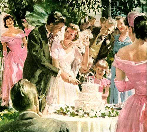
Woman's Home Companion (1949) Anderson, H - 014 |
|
A Changing Style Over the years he changed his style of illustration, or the ultimate look of the finished painting. He felt it was extremely important to grow as an artist and to keep up with the changing times. Therefore, the finishing strokes of any given painting produced in 1947 would differ from a piece completed in 1967. Whatever the period, Harry would work from dark to light, large to small, and simple to complex. After completing the finishing touches, usually crisp highlights, sharp edges, or a small stroke of pure color, he would turn the painting against the wall where it would sit for a couple of days. After a period of detachment, he would set it on his easel and view the painting from every conceivable angle, upside down, and through a mirror searching for any potential flaws that would require correction. He once said, “There isn’t a single picture I’ve made that I haven’t wanted to go back in and fix it up a little.” He also maintained “pictures weren’t finished, they were abandoned.” Once a picture was completed, that was it. Harry didn’t use finishing mediums, varnishes, or fixatives. If the picture required delivery, Harry would custom build the shipping container. |
|
Woman's Home Companion, "Strange Daughter" (1947) Anderson, H - 015 “Strange Daughter” is atypical for Harry, in that it is essentially a singular portrait. created with simple shapes including a minimum amount of detail, it reads as a fully rendered painting. |
|
Esso (19??) Anderson, H - 016 During the 1960s and 1970s, Harry executed a series of illustrations for Esso (later Exxon), titled “Great Moments in American Motoring.” In a field normally dominated by specialists, he was fully aware of the need for historical accuracy. This 1929 Chrysler appears as though it’s ready to drive off the page. |
| Another Life Anderson was still painting within the Sundblom Circle in 1943 when another crisis arose that was directly associated with his life and career. He realized that in conscience, he could no longer continue to illustrate for some of the advertisements and fictional stories he had been depicting. This decision, which would affect him financially, was due to his religious beliefs. |
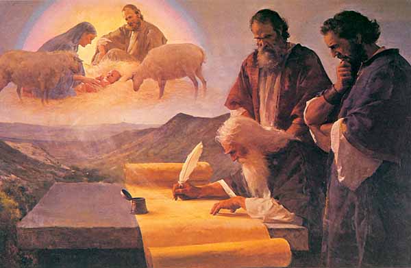
Isaiah Prophesies the Christ (19??) Anderson, H - 017 |
| With two boys and an infant daughter, Harry and Ruth were now struggling only a short time after they had begun to live comfortably. A few years earlier they had become members of the Seventh Day Adventist Church, and in 1944, Anderson was approached by The Review and Herald Publishing Association to produce religious illustrations for them. The artist quietly agreed and for the next 35 years proceeded to reinvent the way religious images and icons were depicted. Before Harry, these images had been presented throughout history as traditionally viewed within the pages of the Bible. Harry changed that by representing various religious characters and events within the backdrop of modern times. This incredible body of work comprised half of his total output.
In 1946, the Andersons moved to Washington. D.C. to be closer to The Review and Herald. Anderson continued to work for many of his high-profile accounts such as Woman’s Home Companion, producing an entire year’s worth of covers in 1949. Each cover consisted of a brother and sister theme, with Anderson’s own son, ?Tim posing as the young boy. However, he longed for the interaction with other illustrators and in I951, moved closer to the New York City area. |
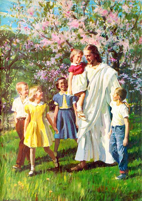
The Friend of Children (19??) Anderson, H - 018 |
| Throughout the ‘50s and ‘60s, Harry continued to produce some of the best examples of his work, but more importantly, in some of the most visible venues. By the ‘70s and ‘80s, photography had taken over as the mainstay for advertising, yet Harry continued to make pictures for Esso (later Exxon), Humble Oil, John Hancock Mutual Life Insurance Company and Redbook. He also continued his devotion and professional relationship with the Seventh Day Adventist Church, and the Review and Herald. By now, Harry was in his eighties and preferred to paint for his own enjoyment, carve his exacting miniatures, or for that matter, paint his barn -- literally.
Harry Anderson was an innovator, a superior draughtsman, and craftsman, sensitive storyteller, and masterful painter, to name a few of his creative abilities. Over the years he received, among others, the Grumbacher Purchase Prize from the American Watercolor Society (of which he was a member), the Clara Obrig Prize from the National Academy of Design (an associate member), and numerous awards from the Art Directors Club of which he was also a member. Additionally, he was elected to the Illustrators Hall of Fame in 1994. Harry would pass away only two years later at the age of 90, marking the loss of one of the last century’s greatest illustrators. Haddon Sundblom said it best: "He is always ahead of the game. The difference between Anderson and other artists is that Harry has knowledge." In 1994, he was inducted into the Society of Illustrator's Hall of Fame. |
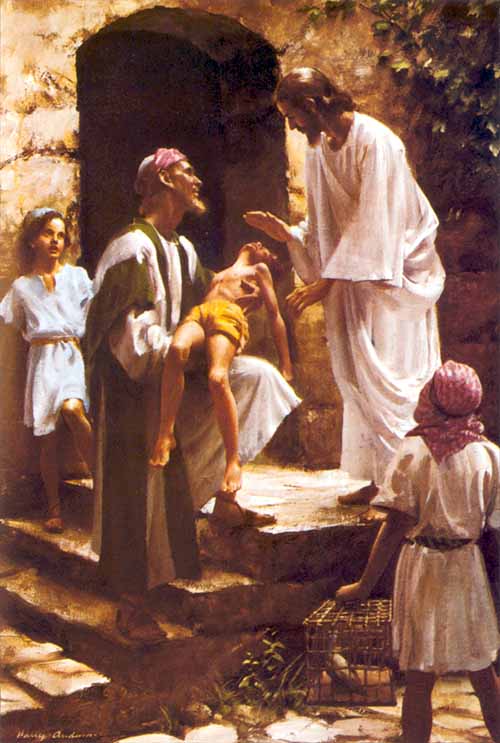
The Divine Healer (1948) Anderson, H - 019 “The Divine Healer" is another example of Anderson’s mastery of composition, light, and color. Our attention is drawn to the man holding the boy. This is created through the placement of the figures, light against dark, and the inclusion of strong color to catch the eye. |
"What Happened To Your Hands?" (1945) Anderson, H - 020 “What Happened To Your Hands?” is probably Anderson’s most widely recognized painting. Although he produced a number of black-and-white paintings for The Review and Herald Publishing Association, this was his first color picture, completed in 1945. Before this painting, religious figures and events had been portrayed as depicted in the Bible. Technically speaking, this is quite possibly Harry’s best work. Everything you ever wanted to know about painting is contained within these brush strokes. |

Harry examines Kent's sketchbook. |
|
Copyright 2000/2005, Kent Steine
Kent Steine is an illustrator and writer based in Madison, Wisconsin. Many years ago, Steine had the fortunate pleasure of befriending Harry and Ruth Anderson. Kent has quickly become a friend of American Art Archives (and me, too). This respected artist's / author's contributions and experience on illustration art to American Art Archives will, I'm ecstatic to say, be ongoing! A "family tree" of Frank Reilly students (and their students in turn) will be appearing soon. For his biography and samples, please visit his website: KentSteine.com |
|
Originally published in the October 2000 issue of Step-By-Step Graphics Magazine, this Masters article has been restored to its original presentation.
|